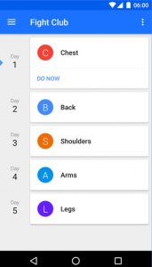
I have used Progression since I started lifting weights back in 2016. I
like the minimalist design which follows Google Material Design but somehow and sometimes navigating the application while working out causes a bit stress.
So today I would like to begin experimenting by redesigning the application itself. And due to the fact I have not had many experiences designing for iOS, I would like to use this opportunity to try redesigning the structure of the app by designing the iOS version.
This project will be divided into several parts. In this part we will take a look at the home screen of Progression.
Getting Rid of The Fatty Hamburger
Eating hamburger is okay. But eating too much can cause problems. And the same analogy can be applied to Android’s hamburger. If an application only have a small number of sections, I personally think Hamburger menu is not necessary.
So the first thing that I did was removing Hamburger menu and adding the section into the button of the screen. I also removed History, renamed Your Schedule to Home and merged Body with Statistics. The content of History can now be found in Home section.
Encouraging The Users
I also played around with the design of the program schedules. In the Android version the schedules are listed vertically. In the iOS version I used a carousel design a la music application.
The focus in the iOS version is that users are encouraged to follow the schedule. That’s why only the next schedule is displayed and the rest is in the background, out of focus. The idea of highlighting the Do Now button is also to triggers users’ spirit.
Below that users can find the history of his workouts, this history doesn’t have to be in relation with the current active schedule, just like the android version.
Quick Navigation
The schedule can be easily changed through Schedule or the more … icon. The more … icon shows Change Schedule and Edit Schedule options to the user. The Schedule section will come in the new few parts.


